The Simplexity SimTrend Indicator

The above chart is for Gold during the end of 2022 and into 2023. The SimTrend indicator at the bottom of the chart is comprised of two lines. The thicker green/red/black line is the SimTrend line. The thinner black line is the signal line.
First, we will explain the SimTrend line. When SimTrend turns to green, (#1 on the above chart) it is an indication of a bullish upward trend change. When the SimTrend line turns red, it is an indication of a bearish downward trend change, (#2 on the above chart). It will rarely turn directly from green to red or from red to green. Instead, it usually turns black (#3, #4, #5 and #6 on the above chart) which is an indication of a neutral trend. Sometimes it will turn black while still in an up or down trend. Turning black can indicate that the current trend is running out of steam or it can be an opportunity to re-enter a resumption of the trend. To help determine which of these two it is, look at how steep the SimTrend line is. If it turns black while the line is still relatively steep, it's an indication of a possible re-entry area as opposed to a trend change. After #3 when SimTrend turns black, the SimTrend line is mostly flat. There is no clear indication of direction in a case like this. But, at #4 and #5, SimTrend turns black and the direction is clearly trending up. These are good areas to enter long in the market on a resumption of the trend.
Secondly, we have the signal line. The signal line is more of a micro indicator of the market whereas the SimTrend line is more of a macro view. Shorter term price movements will be reflected quickly in the signal line as the signal line lags price movement. The signal line will then push and pull the SimTrend line as the SimTrend line shows longer term momentum in the marketplace. Every indicator based on price will always lag compared to price itself.
3 areas to look for entries:
1. The Trend Turnover:
The chart to the right is of 30 year Bonds from 2023. #1 signifies when the signal line crosses under the SimTrend line. This is not an indication of a down trend...yet. However, a few days later at #2 we get confirmation of the start of a possible down trend. This confirmation comes from the SimTrend line starting to show weakness and declining. A few days after, the SimTrend line turns red and price makes a very quick decline.

Other examples of a Trend Turnover:
Crude oil

Euro Currency

Corn

2. The Touch and Go:
The chart to the right is the S&P e-minis from late 2022. This is a re-entry or resumption of trend signal. #1 signifies when the signal line touches or crosses the SimTrend line while the SimTrend line is still green or red. Since it's green or red, we know that the trend is still strong in that direction. Instance #1 actually crosses over for 3 days before resuming the trend again. #2 and #3 practically turned right around after hitting the SimTrend line and resuming the trend.

Other examples of a Touch and Go:

30 Yr Bonds

Nasdaq

Crude oil
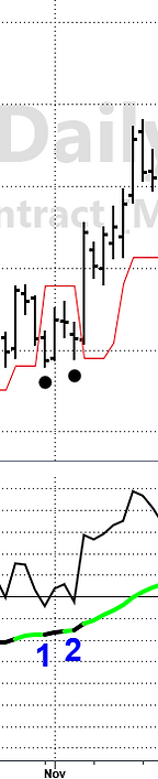
3. The Black Market:
The chart to the right shows Soybeans from early 2022. During a strong trend, the market may retreat significantly enough that the SimTrend line changes from red or green to black. The black dot on the price chart signifies when the SimTrend goes to a 'black market' in real time. The SimTrend line at #1 is pretty flat and even slightly turning down. #1 is probably an area to be on the sidelines waiting for a clearer signal to delelop. #2, #3 and #4 turn black with an increasing SimTrend line. These are good areas to look for re-entries. This signal is similar to the Touch and Go signal but it's a little trickier. The SimTrend line going black means that the market has lost some momentum. We need to watch that this isn't and end of a trend and a Trend Turnover is on the horizon. Generally, we would want a resumption of the trend within a few days of going black. If it goes longer than a few days, it's best to sit on the sidelines and wait until a clearer signal is presented. This is the case at #5. The SimTrend line starts to flatten out and the signal line is continuing to move lower. #5 eventually turns into a Trend Turnover trade.

Other examples of a Black Market:


Gold
Live cattle
Copper
SimTrend Exhaustion indicator
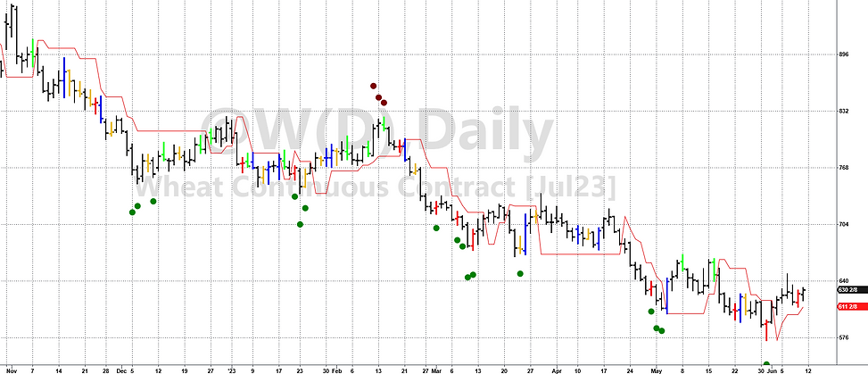
Our newest addition is our SimTrend exhaustion indicator. This indicator plots green or red dots on the chart in areas or price exhaustion. These signals are NOT necessarily areas or a trend reversal (although sometimes they are) but rather more of an area to expect price to have a correction.
Green dots occurring below the price are bullish exhaustion and red dots above the price are bearish exhaustion.
The most effective way we use these exhaustion indicators is for when we are currently in a trade. If one of these dots appear, we will either exit our trade and take profits or really tighten up our stop in order to protect against a price pullback.
These can also be used when looking for setup markets. After a dot appears on the chart, we wait and see if we get the expected pullback in price. If we do, price is either going to reset itself for another entry in phase with the current trend or if it rallies enough, it could signify a top or bottom in the market.
Below are some chart examples of the SimTrend indicator. See for yourself how often price halts at these indicators. Usually it takes more than one dot before we get a reaction. This is a good thing because it affords us a little bit of time to act.
Gold

Nasdaq

Wheat